


Case study · Brand identity
Fifty years of care, one new name.
Righellis and Associates became Hillside View Orthodontics: a strategic rebrand that kept half a century of trust and gave Dr. Ikeda's Oakland practice a name, a look and a story of its own.
- Hillside View Orthodontics
- Healthcare
- Branding, web, content
- 2020
- Identity, website, signage, video, photography
The ask
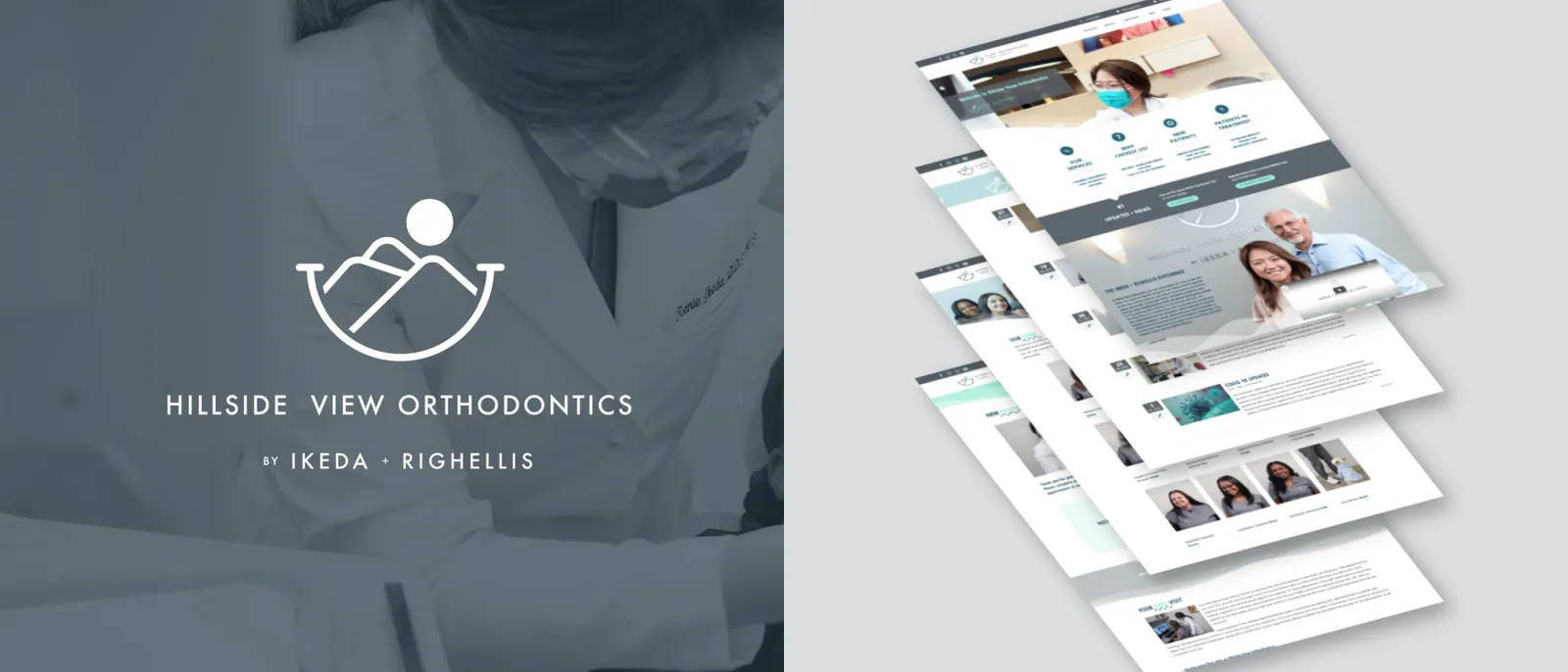
“My orthodontic practice Hillside View Orthodontics needed a new logo and a rebrand.”
The showcase
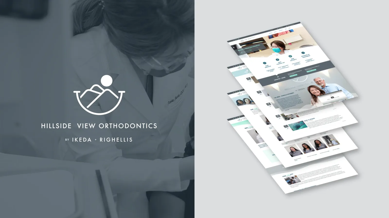
From Righellis to Hillside View.
Past / present
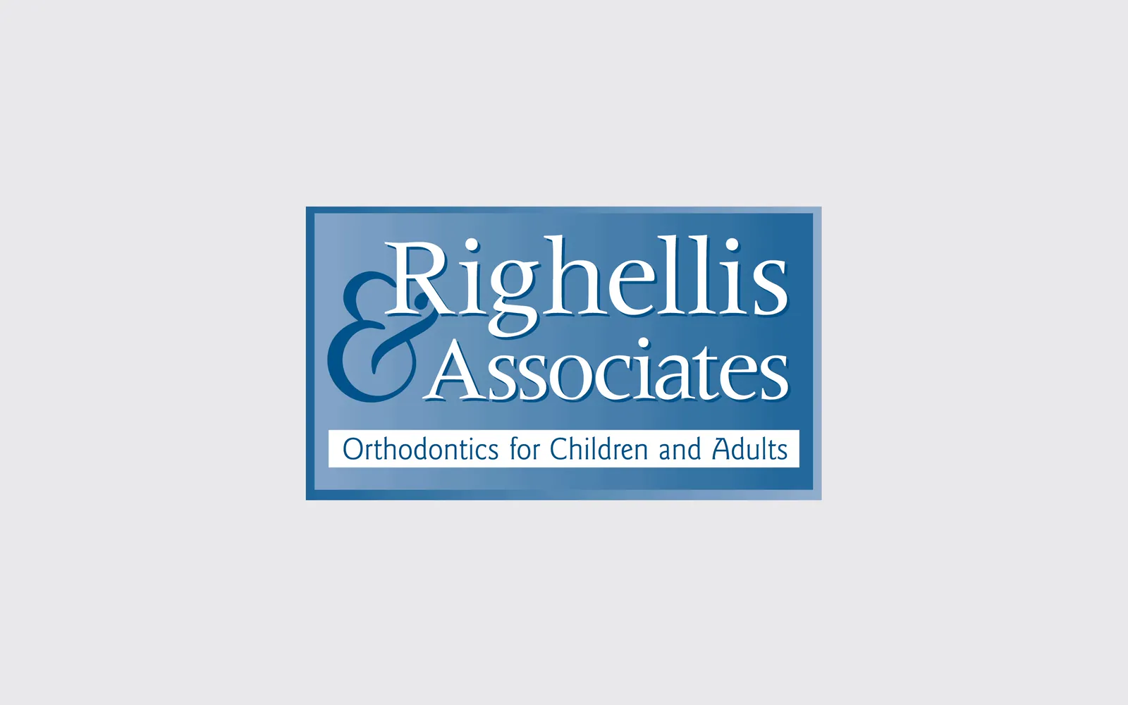
The old mark and the new.
The brand
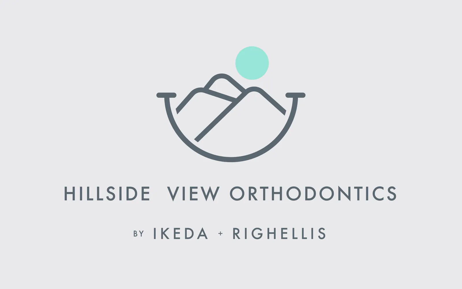
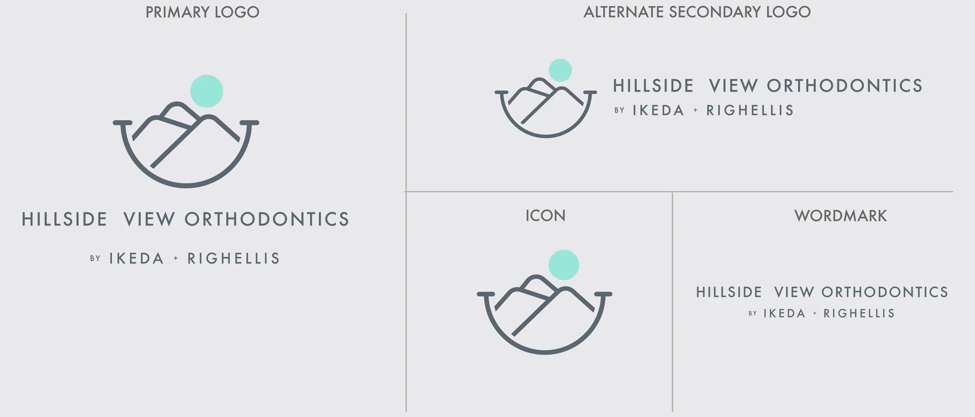
A sun, a smile and the Montclair hills.

The brand in use
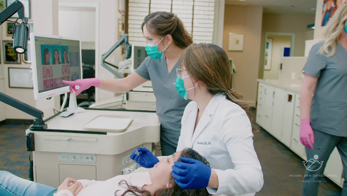
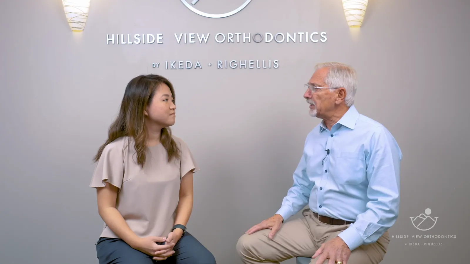
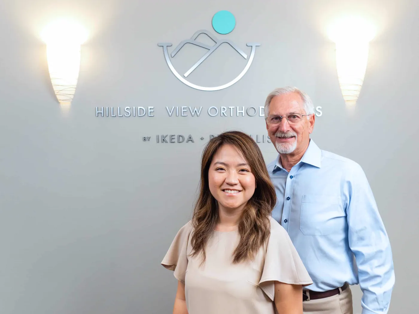
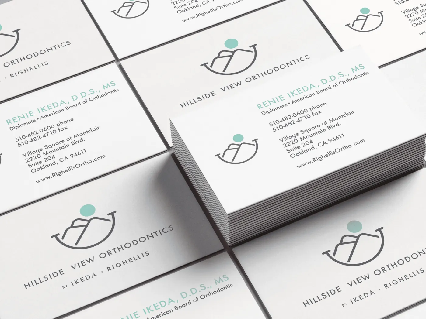
On the wall, the desk and the team.

Behind the scenes
How we got there.

- 01
Listen
Interviews with Dr. Ikeda and the team: what patients value, and what the transition must protect.
- 02
Create
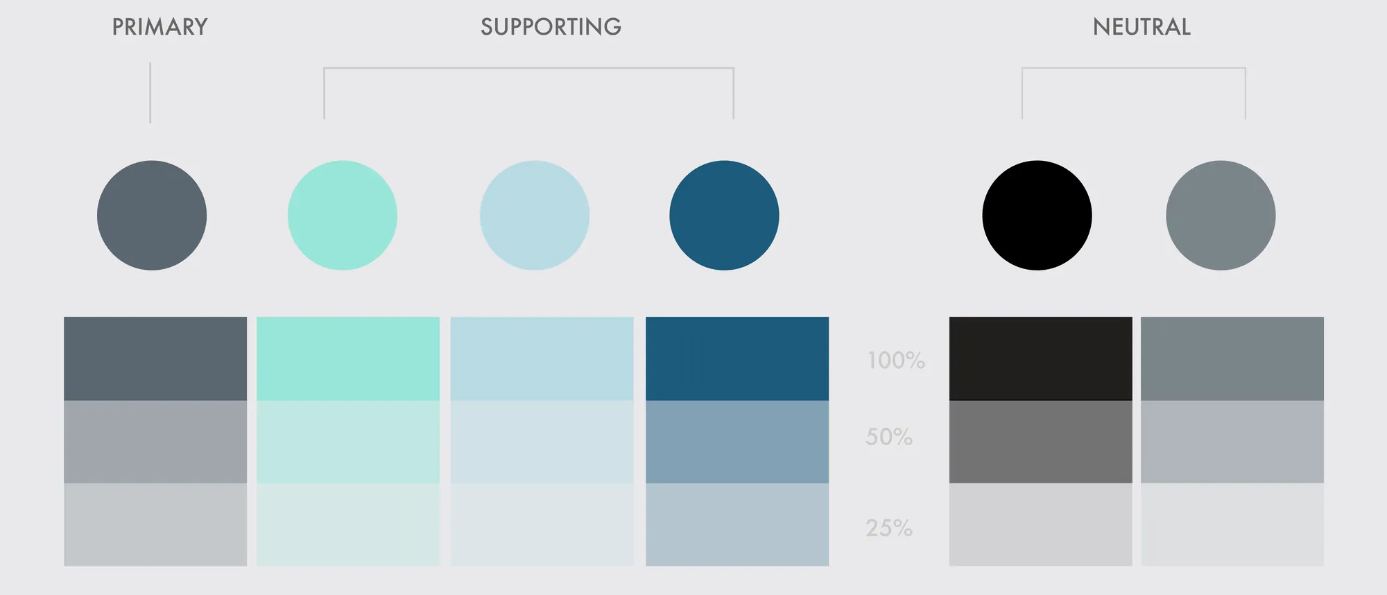
Name, mark and color family, with a narrative built on the relationship between the practice's orthodontists.
- 03
Refine
The website, collateral and outdoor signage on one system; video and photography put faces to it.
- 04
Launch
The practice reopened as Hillside View Orthodontics by Ikeda + Righellis, the founders' names kept in the lockup.
The result
What changed.
- A new name, with Ikeda + Righellis kept in the lockup
- One system across the mark, website, signage, collateral, video and photography
- Patients met the new brand on the building, online and on camera
“440 Creates is a talented team that really gets in there to understand your business and your goals. They are professional, experienced, and easy to communicate with. ... My brand now represents my practice, and I couldn't be happier with the results!”
Sound like you?
Your practice deserves a name patients trust.
Clinics, practices and professional firms: we carry a rebrand all the way to the sign on the door.